Style Guide
A guide to the visual identity and components of Rebel Thinking.
Typography
Aa
Used for all headings and major titles to convey a modern, precise feel. The primary weight is Semi-Bold (600), and it is always displayed in uppercase.
Aa
Used for body text, paragraphs, and descriptions to ensure readability with a touch of warmth. The primary weight is Regular (400).
Color Palette
Primary
#000000
Secondary
#F5F5F5
Accent
#d1ff00
Background
#FFFFFF
Muted
#6B7280
Image Concepts


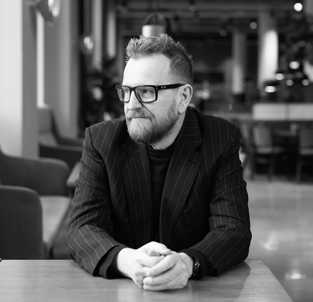


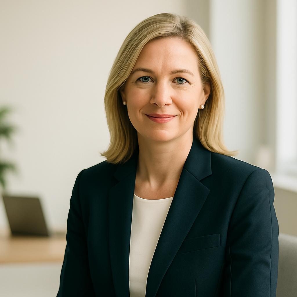


Images are clean, professional, and feature a diverse range of individuals. The style is aspirational yet authentic, often using headshots or environmental portraits. Backgrounds are often neutral or blurred to keep the focus on the person. The hero section utilizes a carousel of these images to represent "Virtual Customers".
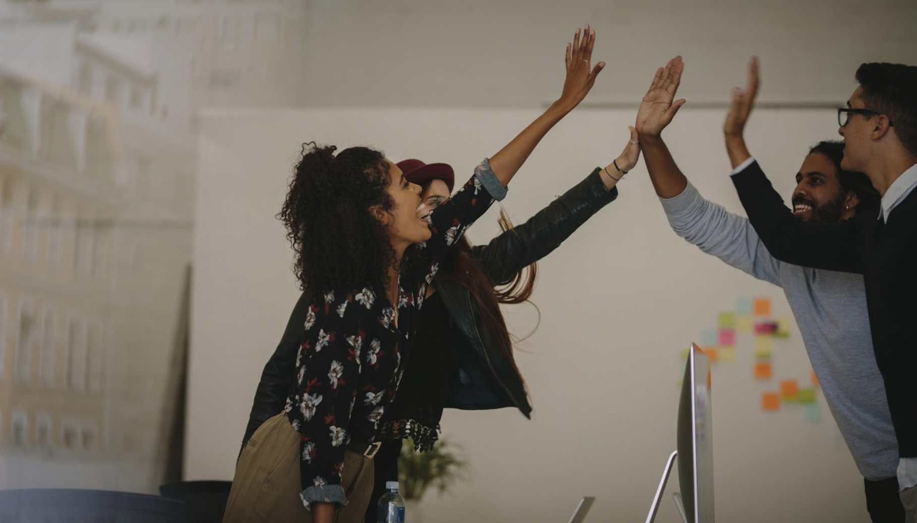

Images of teams collaborating, celebrating success, or actively engaged in work are used to convey energy, partnership, and positive outcomes. These images are typically used in sections related to vision, services, and team introduction.
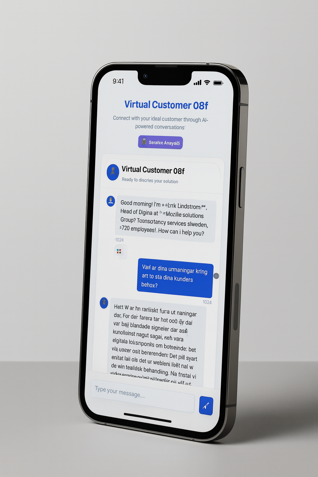
Brand assets and product mockups are used to establish identity and showcase the product in context.
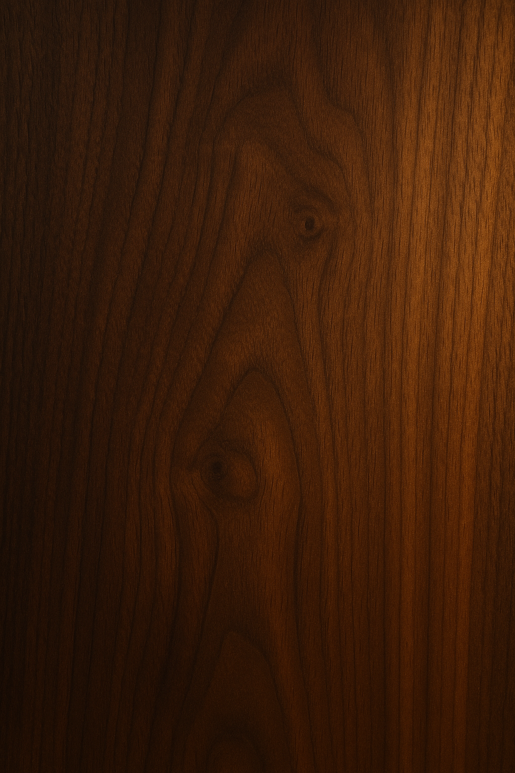
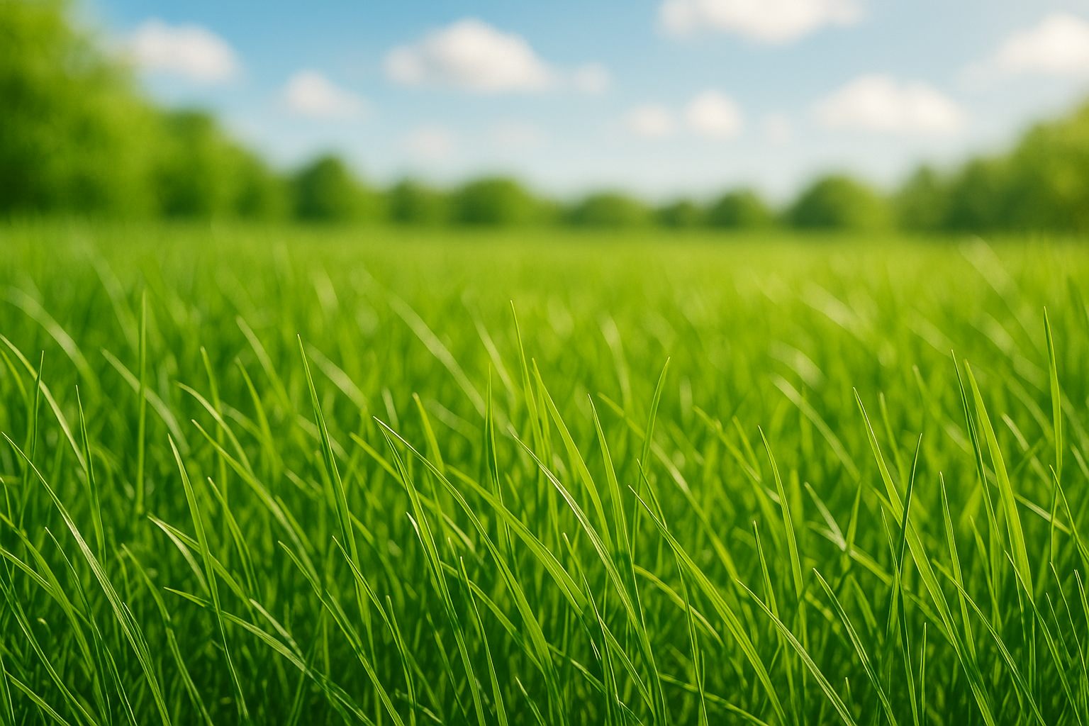
Natural material textures like wood and grass are used as backgrounds to create a sense of warmth and a human touch in an otherwise digital, AI-driven context.
Components (Modules)
Buttons
Buttons feature rounded corners and clear states for hover and focus. The accent color is used for the primary call-to-action.
Cards
This is the content of the card. Cards are used to group related information and have a subtle border and shadow.
Cards have rounded corners, a light border, and a gentle shadow to create a sense of depth and separation from the background.
Accordion
Accordions are used for collapsible content like FAQs. They feature a clean separator and a chevron icon to indicate state.